uitogglebutton (App Designer)

Create toggle button component

Use only with App Designer or figures created with the uifigure function. When using GUIDE or the figure function, create a radio button using uicontrol.

Syntax

  • tb = uitogglebutton
    example
  • tb = uitogglebutton(parent)
    example
  • tb = uitogglebutton(___,Name,Value)
    example

Description

example

tb = uitogglebutton creates a toggle button within a button group in a UI figure and returns the button handle.

tb = uitogglebutton(parent) creates a toggle button within the specified parent button group. The parent button group must be within UI figure window, or within a tab, panel, or button group that is within a UI figure window.

example

tb = uitogglebutton(___,Name,Value) specifies toggle button properties using one or more Name,Value pair arguments. Use this option with any of the input argument combinations in the previous syntaxes.

Input Arguments

collapse all

Parent object of toggle button, specified as a button group object. The parent container must be one created with the uibuttongroup function.

Name-Value Pair Arguments

Specify optional comma-separated pairs of Name,Value arguments. Name is the argument name and Value is the corresponding value. Name must appear inside single quotes (' '). You can specify several name and value pair arguments in any order as Name1,Value1,...,NameN,ValueN.

Example: 'Text', 'French' specifies that the text "French" displays on the toggle button.

The properties listed here are a subset of the available properties. For the full list, see Toggle Button (App Designer) Properties.

collapse all

State of the toggle button specified as 0 (unpressed) or 1 (depressed). Within a given button group, only one toggle button can be selected (depressed) at a time. When the Value property is set to 1, the toggle button appears depressed. The state of the first button added to a button group is 1, by default. Subsequent buttons added to the same button group have a default state of 0.

When the Value property for one toggle button changes to 1, the Value property of the previously selected toggle button in the same button group changes to 0. In addition, the SelectedObject property value of the button group is updated to reflect the selected toggle button.

If you programmatically change the toggle button value to 0, then MATLAB® sets the value for the first toggle button added to the button group to 1. If the first toggle button added is the one that you set the value to 0, then MATLAB sets the value of the second toggle button added to the button group to 1.

    Note:   The first toggle button added to a button group is not necessarily the first toggle button listed when you get the button group children.

Text for toggle button, specified as a character vector or a cell array of character vectors.

Example: 'Steady state'

Example: {'Steady','state'}

File name of the button icon, specified as a character vector.

The file name can be an image file name on the MATLAB path or a full path to an image file. If you plan to share an app with others, put the image file on the MATLAB path to facilitate app packaging.

The image file type must be JPEG, GIF, or PNG.

  • If the button text takes up all the space specified by the Position property value, then MATLAB does not display the icon.

  • If some room is available for the icon, then MATLAB scales down the image to fit, if necessary.

Example: 'icon.png'

Example: 'C:\Documents\icon.png'

Location and size of the button relative to the button group containing it, specified as the vector [left bottom width height]. This table describes each element in the vector.

ElementDescription
leftDistance from the inner left edge of the button group to the outer left edge of the button
bottomDistance from the inner bottom edge of the button group to the outer bottom edge of the button
widthDistance between the right and left outer edges of the button
heightDistance between the top and bottom outer edges of the button

All measurements are in pixel units.

Example: [100 100 100 22]

Examples

collapse all

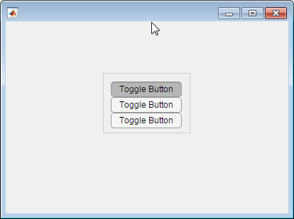
Create toggle buttons by first creating a UI figure window and a button group object to contain the buttons.

fig = uifigure('Position',[680 678 398 271]);
bg = uibuttongroup(fig,'Position',[137 113 123 85]);

Create three toggle buttons and specify the location of each.

tb1 = uitogglebutton(bg,'Position',[10 50 100 22]);
tb2 = uitogglebutton(bg,'Position',[10 28 100 22]);
tb3 = uitogglebutton(bg,'Position',[10 6 100 22]);

Change the text associated with each toggle button.

tb1.Text = 'English';
tb2.Text = 'French';
tb3.Text = 'German';

Change the toggle button selection to German programmatically.

tb3.Value = true;

Determine the font name of the German toggle button text.

font = tb3.FontName
font =

Helvetica

More About

collapse all

Tips

  • Button groups can contain any UI component type, but can only manage the selection of radio buttons and toggle buttons.

  • To make your program respond when the app user selects a radio button or toggle button that is inside a button group. define a SelectionChangedFcn callback function for the button group. You cannot define callbacks for the individual buttons.

  • To determine which radio button or toggle button is selected, query the SelectedObject property of the button group. You can execute this query anywhere in your code.

  • If you set the Visible property of a button group object to 'off', then any child objects it contains (buttons, other button groups, etc.) become invisible along with the parent button group. However, the Visible property value of each child object remains unaffected.

Introduced in R2016a

Was this topic helpful?